Setting scales constant across multiple plots (ggplot2)
23 Sep 2020 —So you have a bunch of plots and they all have color scales with different limits and you realize that eyeballing the numbers trying to normalize the colors in your head is a bad way to compare them, huh?
You could manually review each plot, then manually set the limits of each color scale so that they encompass the same set, and then hope you never change the data in a way that would invalidate those limits, but that’s dumb, huh?
Come along and find out how to set non-position scales to be constant across multiple plots!
The problem
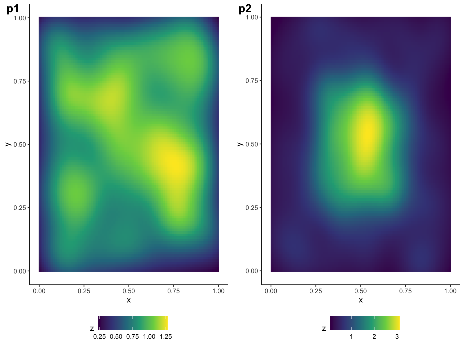
Let’s say you’ve got two plots, p1 and p2. Side by side, they look like this:

The colors lie! They lie to us!
It would be great if the colors meant the same thing across plots, but we can see that the yellow in p2 corresponds to a much higher value than in p1. This can be misleading if you’re comparing the two plots visually.
‘Bad’ solution
Those “fat cats”” at stackexchange might tell you to do something like:
p1 <- p1 + scale_fill_viridis_c(limits=c(0.1, 3))
p2 <- p2 + scale_fill_viridis_c(limits=c(0.1, 3))
where you manually set the limits of both plots to encompass all the values in each. You can do this, for sure.
If you’re a baby.
But seriously, if you’re doing this for a lot of different plots, or if you want to automate it, or the data has changed, then this is a pretty fault-intolerant, slow process.
My hacky solution
After spending a few hours bumbling around the undocumented guts of the ggplot2 code, I was able to put together a pretty nifty solution. I’ve broken it down to three steps / functions.
NOTE: my code only works for continuous scales!
If you just want the function without a walk-through of what it does, jump down to the gist in the source code section at the end of this post. Be wary though, it’s relatively untested!
1: Extract the range of a plot
In order to set the limit of a scale so that it encompasses the range of the union of the plots in question, you have to be able to access their ranges. ggplot2 saves a lot of the calculation-y stuff (like, calculating data for stats_* objects) right until the moment it’s plotted, so you have to make it do that with ggplot_build() (or at least, that’s how I managed it).
Here’s the function that I wrote; given a plot and a scale that you want to eventually apply (e.g., scale_viridis_fill_c("z")), this gets the range of values that the plot uses for the aesthetic of that scale:
simple_range_extracter <- function(p, scale) {
  d <- ggplot_build(p)
  d$plot$scales$get_scales(scale$aesthetics)$range$range
}
Voilà:
simple_range_extracter(p1, scale_fill_continuous())## [1] 0.228773 1.2780652: Get a single shared scale
Now that we can get a single range from a single plot, let’s get the range of the union of all of the ranges for a bunch of plots.
This function takes in any number of plots and the scale you want to use for all of these plots, and returns that scale with the right limits.
get_shared_scale <- function(..., scale) {
  plots <- list(...)
  ranges <- purrr::map(plots, ~simple_range_extracter(., scale))
  single_range <- range(unlist(ranges))
  scale$limits <- single_range
  scale
}
You can use it like this:
get_shared_scale(p1, p2, scale = scale_fill_viridis_c("z"))## <ScaleContinuous>
## Range:
## Limits: 0.0662 -- 3.1Note that you can supply any additional arguments you want for the scale in that scale’s call (e.g., oob, guide, expand, etc.).
While you could take the scale output of get_shared_scale() and then add it to those plots manually,1 that’s still too much work for me.
3: Editing plots ‘in place’
I wanted to be able to make the plots, run a single function that sets the shared scale of all the plots, and then just have those plots be edited, without me having to manually add in a new scale or add extra lines to re-edit those plots.
This next function is probably a little more “dangerous” than the previous two functions, but if you use it in the right circumstances it’s mega helpful. If you’ve assigned the plots to variables in the environment you call set_scale_union() in, it will call get_shared_scale(), get the shared scale, add it to each of the previously-assigned plots, and re-assign their names to the new plots.
# Main function
set_scale_union <- function(..., scale) {
  exprs <- rlang::enexprs(...)
  scale <- get_shared_scale(..., scale = scale)
  var_nms <- purrr::map_chr(exprs, rlang::as_name)
  edit_plots_in_place(var_nms, env = parent.frame(),
                      scale = scale)
  # Invisibly return the scale, in case you need it later
  invisible(scale)
}

# Sub-function
edit_plots_in_place <- function(names, env, scale) {
  vars <- rlang::env_has(env = env, nms = names)
  if (!all(vars))
    stop("Environment does not have variables for ",
         paste(names(vars[!vars]), collapse=", "))

  purrr:::walk(names, function(nm) {
    og_plot <- rlang::env_get(env, nm = nm)
    message("Changing plot `", nm, "`")
    # Muffles messages about already having scales
    withCallingHandlers(
      assign(x = nm, envir = env,
             value = og_plot + scale),
      message = function(err) {
        if (grepl("already present", err$message))
          invokeRestart("muffleMessage")
      })
  })
}
So after we call:
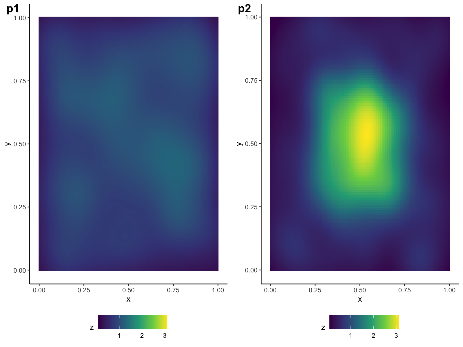
set_scale_union(p1, p2, scale = scale_fill_viridis_c("z"))## Changing plot `p1`## Changing plot `p2`When we go to plot p1 and p2, we find that they now have the right scales!

Now the colors mean the same things across plots! Your graduate advisor sheds a single tear of happiness.
Source Code:
This is the code used in this post, but better because I included some checks to make sure that the scales being used are all continuous scales. I didn’t include that in the examples above because I though they’d be distracting for newbies.
Footnotes:
-
And I specifically made
get_shared_scale()a separate function in case you do want to. ↩