Cleaning/preparing personal weight data
02 Jan 2020 —If you don’t remember my previous post about my custom Bluetooth scale from a couple of months ago, I’ve been collecting a large amount of fine-grained information about my weight for the past couple of months.
In this post, I’ll walk through my initial look at it, some problems I had with cleaning the data, and what I did to fix them.
Part 2: Cleaning/preparing personal weight data
For background on the project this post stems from, check out the first post in the series. For more in this series, check out Part 3 and Part 4.
Data cleaning and sanity checking
Let’s load up the data and put it into the right format, making the time column actual time data (in this case, Unix epoch time, which the numbers in that column represent), and making sure each weight measurement was tagged and from me.
raw_df <- read.csv("~/burchill.github.io/code/weight-data/for_r.csv") %>%
  as_tibble() %>%
  # Turn the `time` column into actual time objects
  mutate(time = as.POSIXct(time, origin="1970-01-01")) %>%
  # Give it the right time zone
  mutate(time = with_tz(time, tzone="America/New_York")) %>%
  # Reorder the columns
  select(-weight_values, everything(), weight_values) %>%
  # Make sure each measurement was tagged and was from me
  filter(matched=="True", grepl("zach", tolower(username)))
The first thing you’ll notice is that there are a lot of columns in this data frame (35)—the way my setup currently converts its JSON data into R-readable files just dumps all the values into their own columns.
Let’s remove a lot of those right now to make things easier for you:
raw_df <- raw_df %>%
  select(-matched,-linkID,-type,-method,-stepped_off,
         -unexpected, -client_js, is_past,
         # Gets rid of all columns with these strings
         -contains("label_"), -contains("expire_"), -contains("offset"))
In order to not ruin any surprises let’s just look at the first couple of rows and columns:
raw_df[1:5, 1:7]## # A tibble: 5 x 7
## X sd median mean ID time sleepwake
## <int> <dbl> <dbl> <dbl> <fct> <dttm> <fct>
## 1 0 5.40 84.5 83.6 b8faf3df2dae… 2019-09-22 21:23:37 bedtime
## 2 1 1.49 84.4 84.1 d2b6581d8e72… 2019-09-22 22:00:56 ""
## 3 2 7.22 83.9 82.8 ced24c21183c… 2019-09-22 22:02:15 ""
## 4 3 5.28 83.3 82.4 3f3a5d1a9366… 2019-09-22 23:54:01 bedtime
## 5 4 3.30 82.8 82.3 0720caf37139… 2019-09-23 09:50:54 wakeupNotice that the first column is named “X”, R’s default for unnamed columns—this comes from the unnamed index column of the pandas data frame that generated it. “ID” is a uniquely generated ID for each measurement, “sleepwake” is a factor we’ll talk about later, and the rest of the columns are self-explanatory.
Outliers: medians are more robust
Each weight “measurement” (i.e., row) is the aggregate of a hundred or so weight samples from the Wii Fit board over the few seconds I was standing on it. These samples are a bit noisy, and probably include samples where I was getting on or off the board. The columns we saw above (sd, median, and mean) reflect the summary statistics of these samples.
Here are the mean values:
raw_df %>% ggplot(aes(x=time, y=mean)) +
  geom_point() + mean_y_scale +
  ggtitle("Means")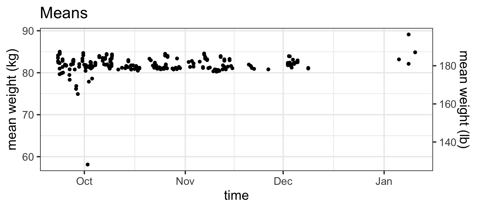
Means of samples have outliers...
As you can see, there are some values that seem very suspect. But what about the medians?
raw_df %>% ggplot(aes(x=time, y=median)) +
  geom_point()+ med_y_scale +
  ggtitle("Medians")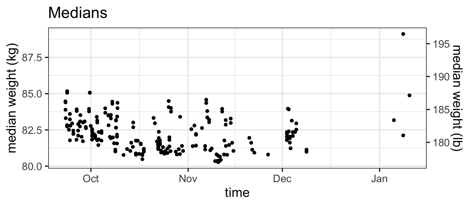
...while the medians do not.
Yes, what you are taught in intro stats classes is true: the median IS more robust to outliers than the mean! From the plot above, you might want to move on and just stick to using the median values, but something about those huge outliers of the means seems suspicious.
A deeper cleaning
Let’s look at the individual samples, which are stored as comma-separated strings in weight_values for each measurement to see what’s going on:
raw_df %>%
  # Extracting out the individual samples
  tidyr::separate_rows(weight_values, convert=TRUE) %>%
  # Filtering a particular subset of older weights
  filter(X < 90, git_hash=="") %>%
  ggplot(aes(y = weight_values, x = as.factor(time), color = mean)) +
  geom_boxplot(outlier.alpha = 0.1) +
  scale_y_continuous("sample weight (kg)",
    sec.axis = dup_axis(trans = ~2.20462*., name="sample weight (lb)")) +
  theme(axis.text.x = element_blank()) +
  labs(x = "logged weights", title = "There are some crazy outliers") +
  viridis::scale_color_viridis(guide=FALSE)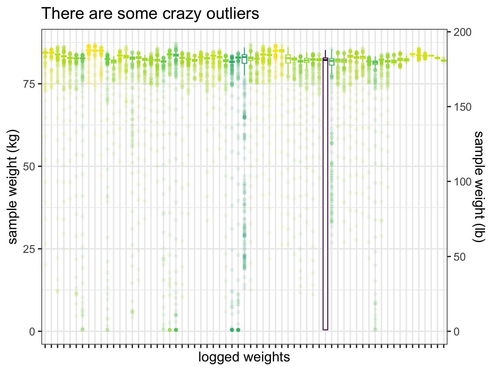
Boxplots of the individual samples for each logged weight (before I fixed this problem). Notice that the interquartile range of one measurement almost hits 0 kg.
Clearly, many of these samples are just wrong and one measurement’s interquartile range extends down to almost 0 kg!
A go-to move for cleaning outliers might be to exclude samples by z-score thresholds, but removing sample outliers by z-scores won’t always correctly clean the data. For that particularly outlier-filled measurement, there are no samples with z-scores > 3 SD:
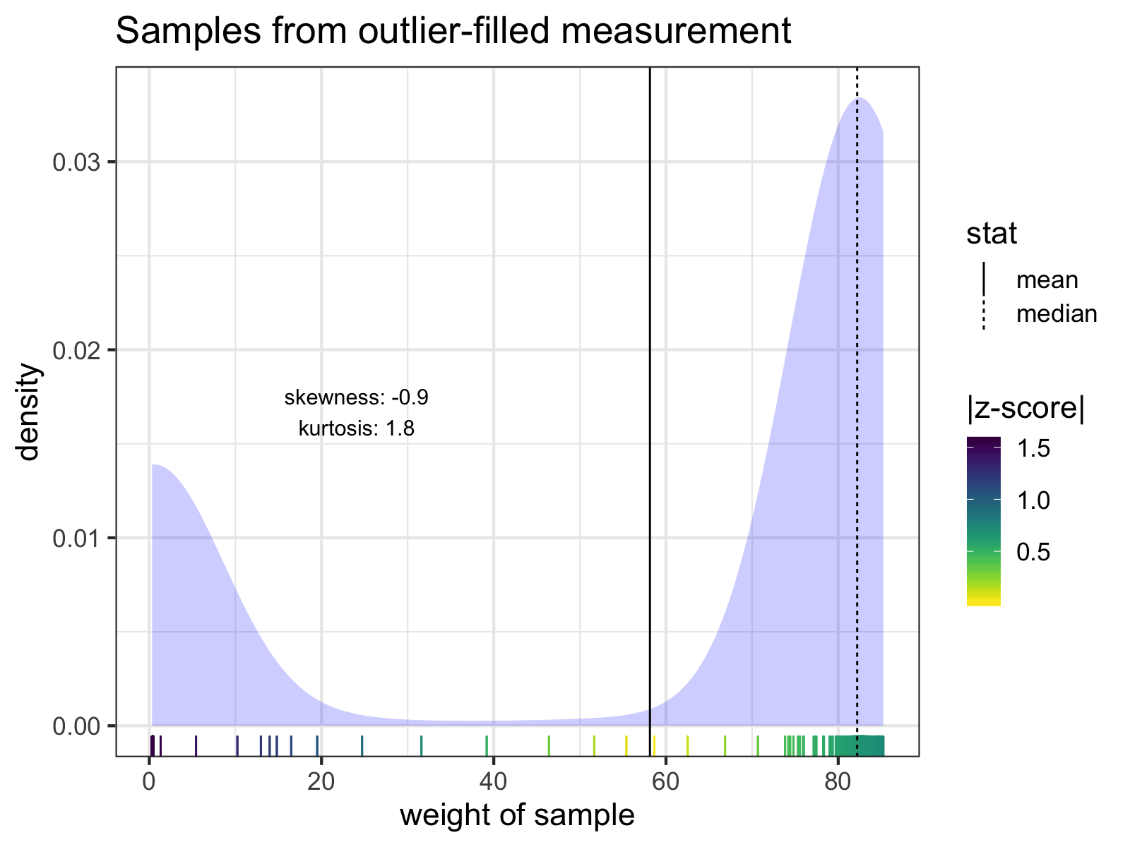
The individual samples of the measurement with the lowest mean weight. Notice how none of the z-scores of any of the samples exceed 3 SD from the mean. The mean and median of the samples are indicated with solid and dashed lines, respectively. Skew and kurtosis are also shown.
However, I know roughly how much I weigh. I know for a fact that I will likely never weigh less than 60 kg (~132 lb). Therefore, any sample < 60 kg is an error, and I can exclude it before calculating z-scores.
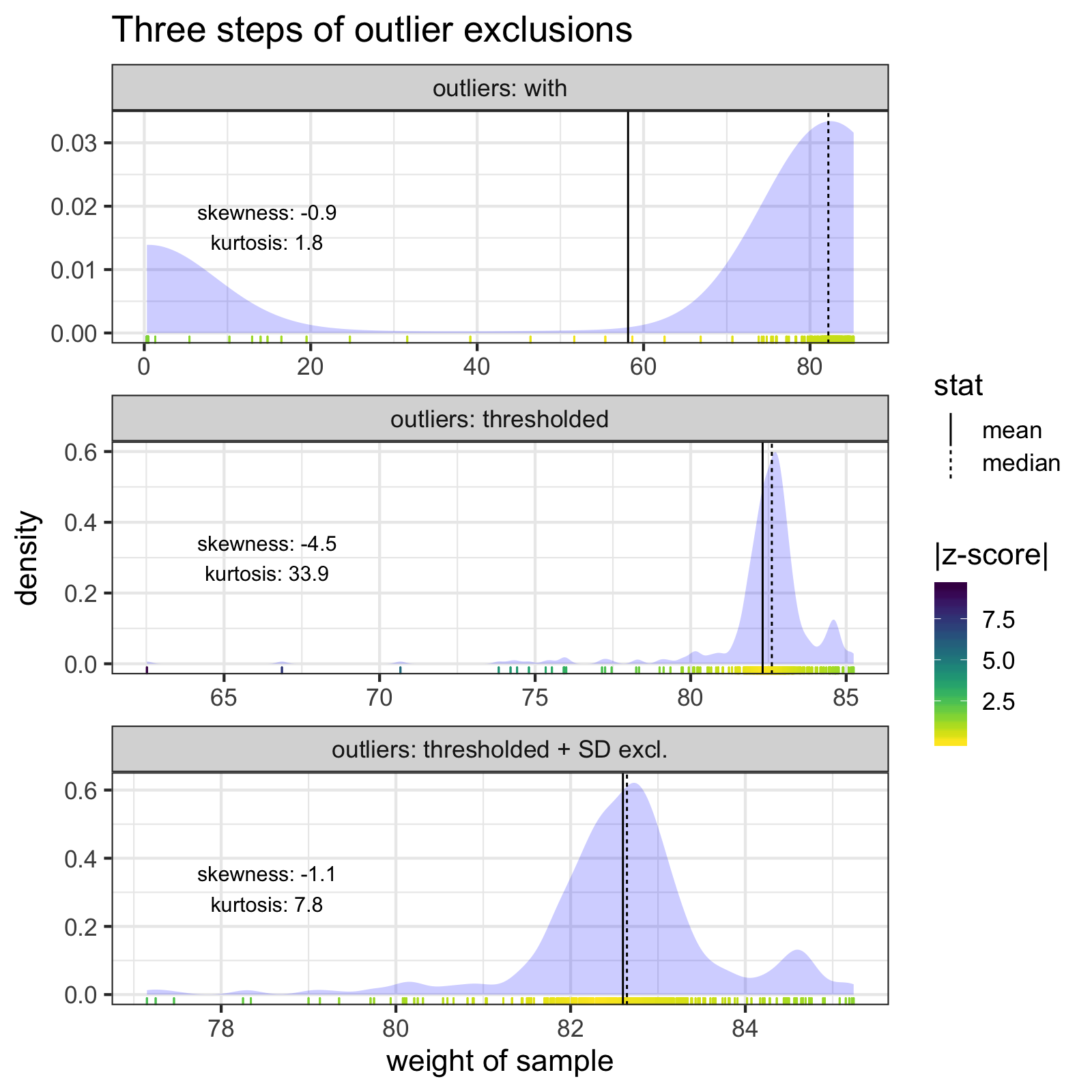
The two outlier steps (thresholding and z-score exclusions) together do a much better job of cleaning the most troublesome measurement, and bring the mean an median much closer together.
When we apply these cleaning steps to all the measurements, the individual samples look much better.
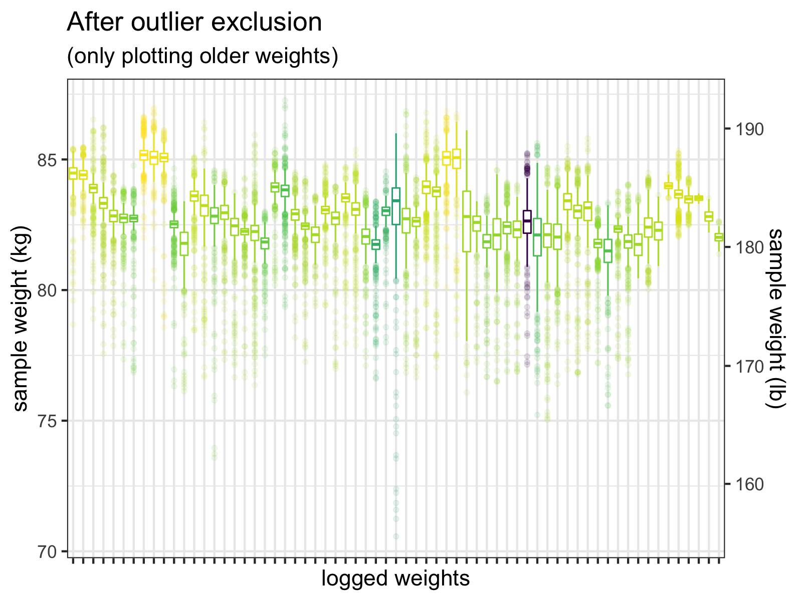
After I exclude samples <= 60 kg, and then exclude outliers > +-3 SD, the outliers are much less extreme. We do see a few values < 75 kg, but these could be real weights. (Wishful thinking, perhaps.)
Importantly, after I noticed this problem, I made a few changes to my weight-capturing system, so I won’t have to clean new measurements.
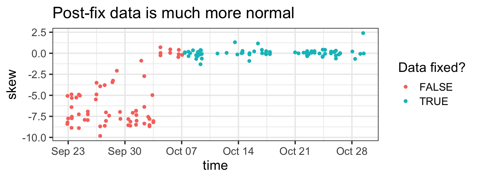
You can clearly see when I fixed the problem by how less skewed samples are in newer measurements (although skewness isn't a great indicator of outlier-ness here, tbh).
Analysis
So let’s get cracking, what kind of insights can we glean from this data?
Background: clothing matters for micro-measurements
When you’re weighed at the doctor’s, the nurses don’t care if you take your shoes off—it’s just a few pounds—but in my case I’m making enough measurements that a few pounds of shoes, wallet, and phone is going to make a difference.
In order to get around this, my weight-capturing system lets me “tag” weights, giving them additional metadata/context. Since I know the amount of clothing I wear will influence my weight, I’ve broken my clothing status into three categories:
-
When I’m wearing “full” outfits (what I would wear outside, shoes, phone, jacket, etc.)
-
When I’m wearing lighter outfits (loungewear, sweatpants, no shoes)
-
When I’m wearing only my birthday suit 😳
df.clean %>%
  ggplot(aes(x=time, y=median, color=clothing)) +
  geom_point() + geom_smooth() +
  theme(legend.position="bottom") +
  med_y_scale +
ggtitle("Clothing affects weight (duh)") 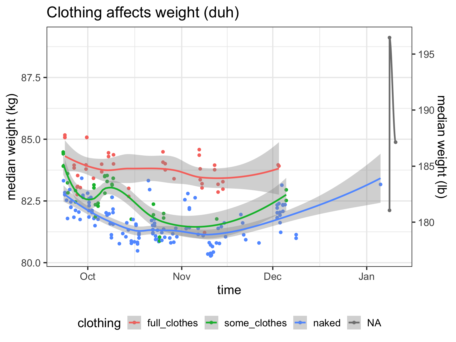
These are pretty loose categories, but right away, we can see that they explain a lot of the variance of the data. Since being naked is the closest I can get to measuring my “true” weight and varying clothing per day adds extra noise to the data, I’ll generally stick with my “naked” measurements as being the gold standard.
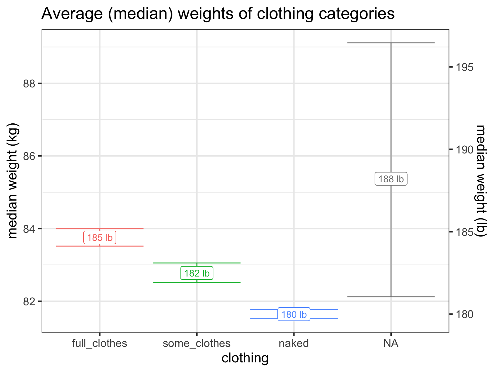
It looks like I wear about five pounds of clothes!
The Actually Interesting Questions
Now that we’ve gotten the boring bits out of the way, we’re ready to get to the juicier questions. Sadly, this post is getting too long, so you’re going to have to wait until I publish the next installment. Look forward to it soon!
Source Code:
If you want to see how I did what I did in this post, check out the source code of the R Markdown file!