Modeling long-term weight data with GAMs
04 Jan 2020 —Previously, I’ve talked about how I’ve started to collect fine-grained information about my own weight and how I went about cleaning the data for analysis. Before I go into my experiments, I’m making a temporary detour into different modeling questions.
Feel free to come along with me as I try to make sense of trends in my own weight with generalized additive models!
Part 3: Modeling long-term weight data with GAMs
For background on the project this post stems from, check out Part 1 and Part 2 of this series. For more in this series, check out Part 4.
Background: calibration
After having hacked my Wii Fit board to serve as a Bluetooth scale, I was crestfallen to discover that it actually seemed to be slightly inaccurate—when I weighed myself on the scale in my bathroom, the readings were always slightly different. Luckily, the weight-tagging system I had made is easily adjustable to allow for adding calibration information.
I made a few measurements on both scales with various weights, and whipped up a very simple calibration curve you can see below.1
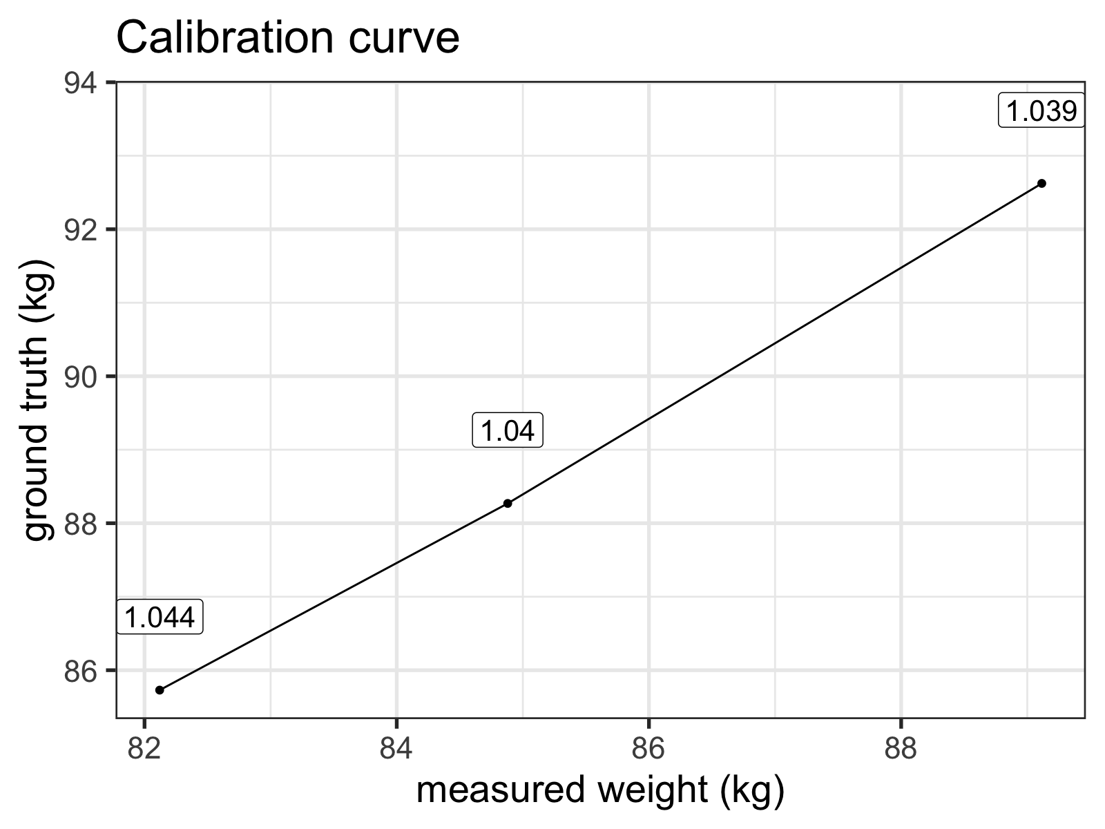
The labels indicate the ratio of the 'ground truth' (my bathroom scale) over the Wii Fit measurements.
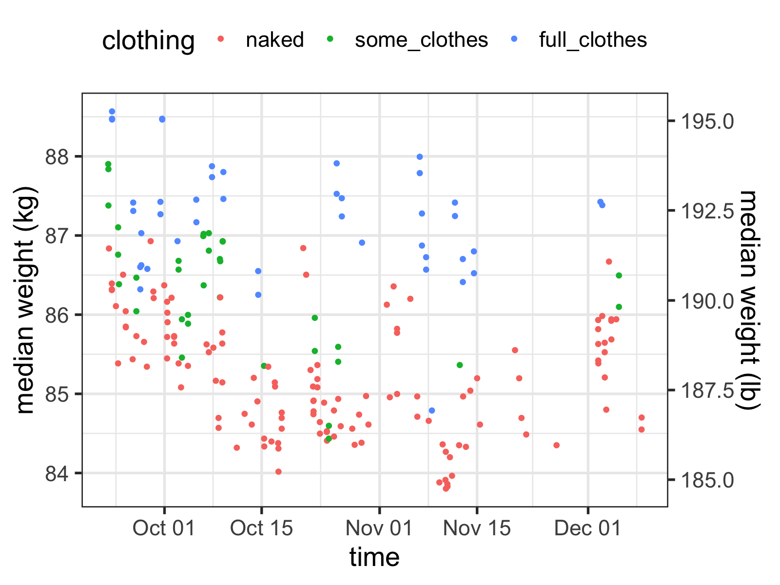
After calibration, the measurements looked much more accurate:
Making sense of noisy time series data
So how do I get a sense of what my real weight is? It seems like I’m all over the place, and whether or not I’m wearing clothes makes it even more complicated!
Well, that’s to be expected: your body’s weight changes over the course of the day, and fluctuates as you eat, breathe, and use the bathroom. Weight gain/loss is a noisy process—it’s only when you average across longer periods of time can you get a sense of overall movement.
And true to the name, a moving average of my weight data would probably be pretty helpful. If new to stats, I would recommend doing that before you attempt what I’m going to do here—like all data scientists, I just want to show off the new techniques I’ve been learning.
The type of technique I’ll be demonstrating isn’t just for show though. By using a regression model to investigate my data, I can regress out many of the effects that aren’t important to finding my “true” weight: I can take a clothed measurement and infer what my base weight would be from that, for example.
Generalized Additive Models (GAMs)
I learned to use generalized additive models (GAMs, for short) doing research in psycholinguistics, but they’re a very flexible class of models—for example, I’ve applied them in industry for machine learning, and now I’m using them for time series data here.
I won’t say I’m an expert in the theory behind them, however, so if you catch me doing anything that’s not kosher, drop me a comment below or yell at me on Twitter. Also, shout-out to Gavin Simpson at UCL for his exceedingly helpful blog posts about applying GAMS to time series, and for his awesome gratia R package, which I will be using here.
If you want to learn what GAMs are, this probably isn’t the place. But at a very naive level, they’re simple to understand: they’re just like linear regression, but instead of using straight lines, they use lines that are allowed to “wiggle” (called “splines” or “smooths”). This ability lets you fit non-linear relationships to your dependent variable.
For example, after putting the data into a more GAM/regression-friendly formatting, I can fit a very basic model to some data and compare it with a similar linear regression model:
library(mgcv)

lm_test <- lm(median ~ Time_n, data = dummy_df)

# `k` is used to set the number of 'knots' in the wiggly line
# Convention wisdom is to use higher values and let the model
#   reduce that number as it sees fit.
gam_test <- gam(median ~ s(Time_n, k=60), data = dummy_df)

bind_rows("lm"  = mutate(dummy_df, pred = predict( lm_test)),
          "GAM" = mutate(dummy_df, pred = predict(gam_test)),
          .id = "model") %>%
  ggplot(aes(x = time, y = pred, color = model)) +
geom_line() 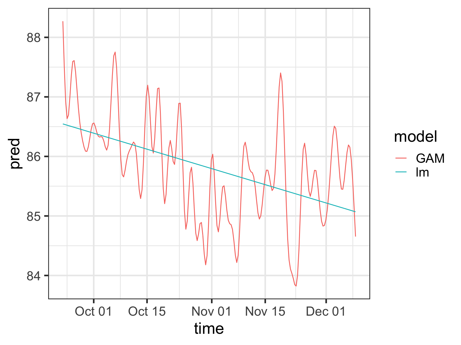
Simple linear regression vs. a GAM fit to the same data. Notice the wiggles in the GAM predictions.
So the GAM model is wiggly all right, but doesn’t it seem too wiggly?
Sadly, the “right” approach in statistics is very rarely the simplest. The GAM in the plot above is potentially over-estimating how important the individual data points are. Why? Well it doesn’t take into account a little something called autocorrelation.
Autocorrelation: ugh, am I right?
Imagine I ask you to guess my weight. I’ll give you all the information you need, other than anything about my current weight. What might be the best thing to ask for?
Probably my weight from one minute ago.
See, anybody’s weight is mostly a function of what it was most recently—these weight measurements of mine aren’t independent of each other, an important part of the assumptions underlying many types of regression. Since the GAM has no way of knowing this without me telling it, it’s as if it were stumbling on two weights measured a minute apart, and thinking, Wow, this one is 185 pounds too! That must be really important!
We need to be able to tell the GAM functions that these points are correlated with other points near to them in time for it to be as accurate as possible. Fortunately, we can do so in a variety of ways.
Telling the GAM about the autocorrelation
If we try to stick closely to the mgcv R package (the best one for making GAMs), there are two ways we can address this type of autocorrelation. The first is to use the bam() function instead of the gam() function. The bam() function is basically the same thing, but is useful for fitting models to huge data sets. It also has a rho parameter, which lets us take care of our problem with an AR1 model. I’m going to go into the specifics of what an autoregressive model is right now, but AR1 models are what we’ll be using to tell the GAM about these autocorrelations.
The only issue with this approach is that, sadly, this way won’t work for my data. As far as I can tell, the AR1 model in bam() uses the order of the rows in the dataframe as a proxy for the temporal separation between data points, which in my case are not equally spaced out.
Fortunately, there’s another way to do it: we can use the gamm() function, which, like bam(), is similar to gam(), but also insidiously different. Through my struggles with this data set, I’ve learned the difference, but suffice it to say, all you need to know is that gamm() is less user-friendly, easier to mess up, and is built on top of the lme() function of the nlme package.
lme() has a correlation parameter that lets you specify the correlation structure of the data, which you can use via gamm(). To give it the autocorrelation structure we’ll need, I’ve used the corCAR1() function (since we’re using unevenly-sampled time series data).
m_ar1_test <- gamm(median ~ 1 + s(Time_n, k=60) + clothing,
                   correlation = corCAR1(form = ~Time_n),
                   data = gam_df)
Notice the form parameter: by default corCAR1() does the same thing as the bam() AR1 model, but by supplying it with a time variable explicitly the GAM will know how the data points are temporally distributed.
When not to use autoregression
So I have to admit, I played around with these models a lot. Since they’re not my forté, I was doing some learning on the fly. I ended up finding out that the scale of my time covariate (i.e., what I was using as the form parameter) radically changed my results. In desperation, I turned yet again to stackexchange, and Gavin himself came to the rescue: evidently the smooth of the time covariate (which I had in my model) and the AR1 process couldn’t be uniquely identified—they were so similar, the fitting process had difficulty deciding which it should attribute variance to, making it unstable.
You can see for yourself with the intervals() function. I.e.:
Scroll down to where you see something like:
 Correlation structure:
           lower         est.        upper
Phi 2.808139e-29 8.388738e-18 2.505957e-06
That Phi is the estimated correlation value for your AR1 process, and if it’s really close to zero (like it is here), it probably means you don’t need it in your model. Likewise, if you get an error saying something like cannot get confidence intervals on var-cov components: Non-positive definite approximate variance-covariance, you probably shouldn’t be putting it in your model either.
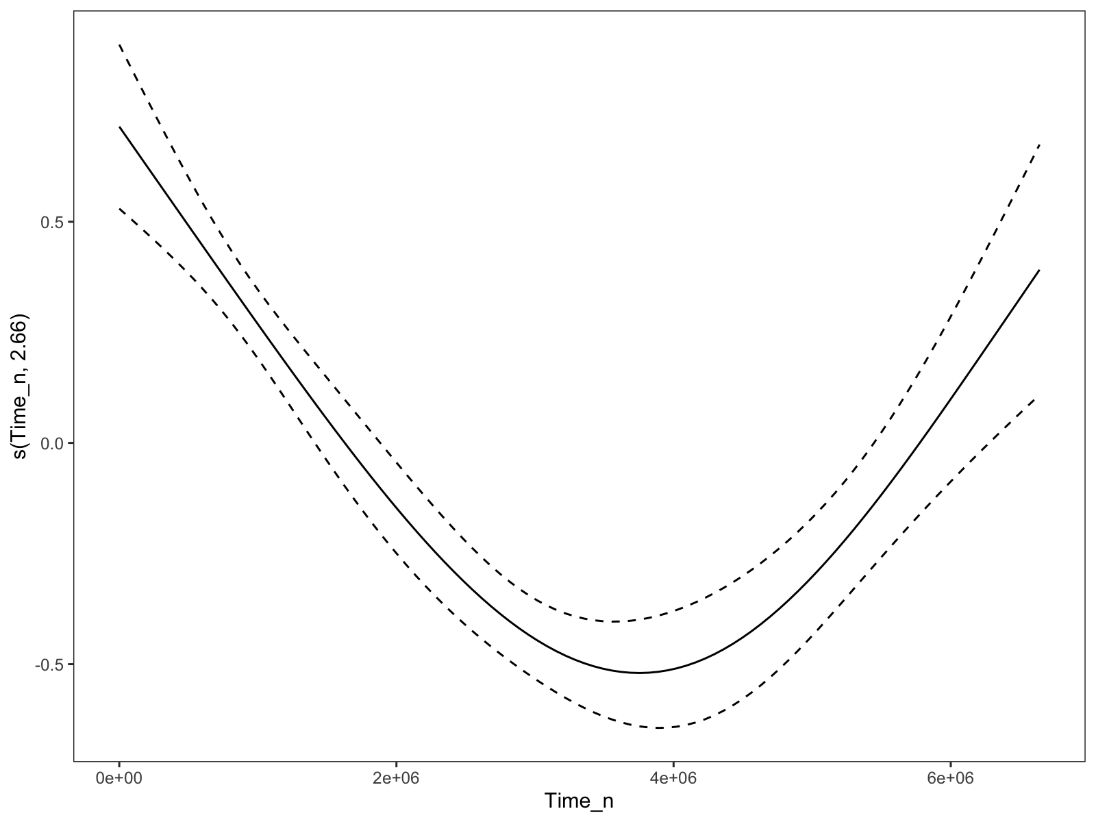
Unfortunately, that leaves us with a model that is a bit too wiggly for my taste, if we follow conventional wisdom and bump up the number of basis dimensions (via k):
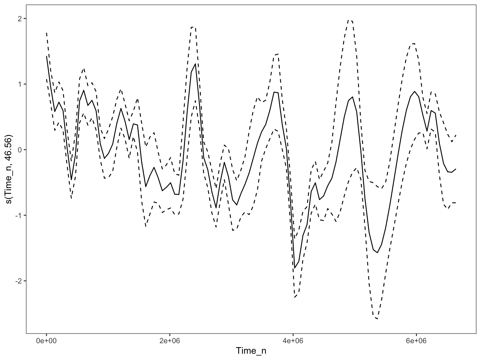
The time trend when the `k` parameter for the time smooth is set to 60. Much too wiggly.
I could bump k down to 4, and I’d get something much nicer:
The time trend when the `k` for the time smooth is set to 4. A bit better, but depressingly arbitrary.
But that’s so manual. I’ve literally spent hours trying to find some way to make the model less wiggly, but automatically less wiggly. I couldn’t find an easy way of increasing the spline penalization, and although using the week number as the time variable worked, it felt wrong and would hinder extendability.
Solution?
However, I lucked out when I went back to the analyses that I was supposed to write for this blog post: after collapsing the before-and-after measurements, the time smooth had much fewer basis functions, and was basically at the level of smoothness that I was aiming for.
This makes sense—even if the model knew about the time-based autocorrelation, the weight “jumping” between the before and after measurements might coerce the spline to be more wiggly to account for the more “disjointed” data.2
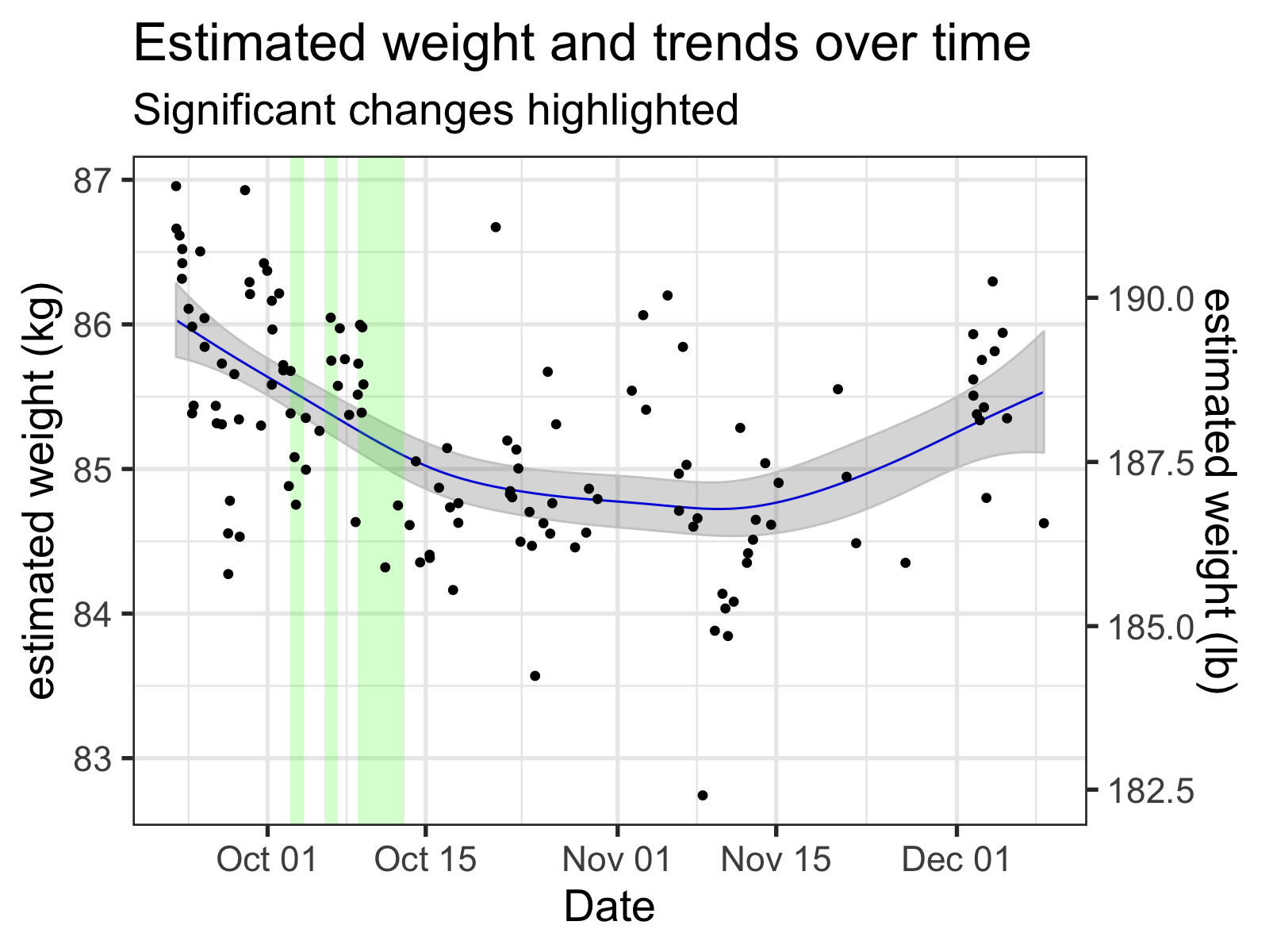
My inferred 'naked' weights, along with the time smooth from the GAM. Regions where this smooth was changing significantly (i.e., where the simultaneous 95% confidence interval of the derivative did not include zero) are highlighted, with green meaning a significant downward trend and red indicating upward.
So that’s cool.
Lessons learned:
When it comes down to it, the choice to use GAMs in my analyses is thornier than I originally thought. I already knew that GAMs aren’t magic wands we can wave to perfectly fit our data, but issue of reducing the number of basis functions in a principled way has made me think about my models more.
What are you using the GAM for?
If GAMs only ‘work’ when I take out my experimental before-and-after regressors, I might want to use a different model. Then again, irregularly-spaced time series can be pretty annoying to work with when using other models—the classic ARIMA models are usually applied to time series take at regular intervals, for example. Kalman filtering seems pretty cool, but I’m not going to get into a whole new thing when I’m already procrastinating with these blog posts.
However, if my original intent is to let the GAM model soak up as much of the random time-related variance as possible (so I can get estimates for the effects of the experimental predictors) then maybe it still makes some sense. Letting the time-related smooth get greedy while still having ways of preventing too much overfitting (which mgcv has tools for) means I have to worry about dealing with the problems of autocorrelation just a little less.
Fitting a full model with a very wiggly time smooth gives me estimates for my experimental predictors that are pretty close to their real effects (which I’ll talk about in my next post). For a “kitchen sink” approach to the problem, this one works pretty well.
Getting significant changes
GAMs are also nice in that you can calculate the slope (i.e., derivative) of a smooth at any point and determine whether it’s significant. This might be helpful if you want to see whether certain periods of dieting are having any effect on your weight change, or to set up a script that messages you whenever you start to gain weight. You can see them highlighted in the previous plot.
Unfortunately, this significance is 100% tied to the exact shape of the smooth (of course). If the wiggles in your smooth are picking up on variance that isn’t important, it can tell you that changes that aren’t important are significant.
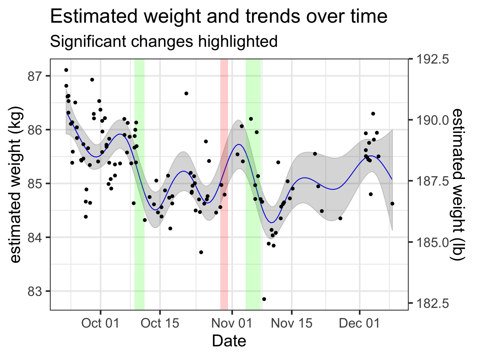
The time spans that are 'significant' change wildly depending on the arbitrary wiggles of the smooth. Here, the time smooth is generated GAM with the number of basis functions set to 12.
If I want to be able to automatically get notified when I’m actually starting to gain weight, I think I’m going to use a simpler exponential smoothing model, maybe one that also uses a GAM to remove some of the periodic effects beforehand.
See you next time for my (hopefully) final post on this topic, where I’ll be taking a look at the experiments I did!
Source Code:
If you want to see how I did what I did in this post, check out the source code of the R Markdown file!
Footnotes:
-
R makes this sort of calibration very easy: check out
approxfun()for making linearly interpolating calibration functions. ↩ -
But, well, it also doesn’t totally make sense.
For example, the wiggliness also disappears when I merely subsample the original data, although that could amount to doing an inefficient version of what I just did. But, when I model the same data with thegam()rather thangamm(), the wiggliness is still there.
I suspect the good behavior that I’m seeing might be more of a quirk of the smoothing parameter estimations inmgcvthan anything else—my hunch is that it’s mostly a product of the relatively “small” amount of data (130 data points) in the collapsed data set. I’ve run a few tests, but they’re inconclusive. I should find out as time goes by though. ↩